Tuesday, 25 June 2013

EXP 3: FINAL SUBMISSION


SKETCHUP FILE: http://www.mediafire.com/?pb2k55a91195k86


NOTE: Unfortunately, all of my CryEngine files became corrupted whilst transferring the files from my own laptop to the Red Centre computers. I then lost my USB whilst travelling back home which made recreating these rather difficult. I have worked to try and recreate my elevator today however a more recent file has also became corrupted. At the risk of receiving a greater late-penalty, I have created my screen captures from images previously recorded from my model prior to these issues. Unfortunately, I only took still images and no video recordings - an aspect of my assignment which I hoped to complete before submission. I understand that this is unacceptable, however it was an issue which was unavoidable. I have included my Sketchup model of the elevator/folly parts (in addition to my bridge/school model) and a screenshot of an earlier flowchart for my CryEngine elevator. I hope these are sufficient.


Wednesday, 12 June 2013

EXP 3: CONCEPT DEVELOPMENT


Architect and planner David Pearson proposed a set of rules regarding organic architecture, among these include the following points:

                   Let the design:
  • be inspired by nature and be sustainable, healthy, conserving, and diverse.
  • unfold, like an organism, from the seed within
  • satisfy social, physical, and spiritual needs.
  • "grow out of the site" and be unique.
  • express the rhythm of music and the power of dance.
I want my design to satisfy these rules, both in the bridge design and design of the university spaces. The flowing movement of the bridge's pathways/framework is inspired by the roots of a tree, and is to appear as if it has literally grown from the edges of the valley's mountains. In the last studio session, Ro suggested considering the functionality of the pathways and the bridge's overall connection to the mountains. As such I have developed the pathways of the bridge so that the ends of the pathways come together closely at each mountain, but spread out in the middle of the bridge to allow the formation of voids which will allow for organic-shaped buildings to be placed within the 'web' of paths. Thus, the bridge unfolds and 'grows' from the site, whilst the curving/rising-and-falling nature of the paths expresses the rhythm of music, creating a flow of lines similar to notes on sheet music - an important idea to me as I have been reading sheet music and playing piano for almost all of my life. 

On a less aesthetic notion, in the development of my idea, I began to consider the social and cultural connection of the bridge to the landscape. As this site is a world heritage-listed site, any development of this nature would realistically be impossible, however in this proposed design, I wanted to ensure that the site was not damaged by the bridge/university. Thus, the proposed bridge ends will meet with lookout points which are realistic developments that promote tourism as well as access to the university. The bridge ends, where all the pathways come close together, and particularly the main walkway (the walkway which is based off the assigned plan/sections) will meet these lookout points and thus will focus on minimum connection to the actual mountain, but rather to these lookout platforms. Additionally, the bridge will not use any supporting frames touching the valley floor so as to minimise impact on the landscape. Thus, where the university buildings are placed (where the bridge expands in the centre) the only space which is being taken up was already void space. This will allow the bridge to aid as a promoter of tourism - a big focus in Australia - by both providing access across the valley but also providing exquisite views across the vast landscape.  

Monday, 3 June 2013

EXP 3: PLAN AND SECTION DRAWINGS AND S/UP MODEL

My chosen plan to work with is shown below. The curved walls reflect the curving stairway 'pipes' of my bridge both in plan and section, so this was a useful plan to develop from.

Below are my plan and section drawings based from my tracing of the original plan. Whilst they are still fairly undeveloped, the exercise was useful in determining potential spaces to define to each space, and the shape of the void formed between these tubes - for example where a narrow vertical room would go and where a wide horizontal space would go. 


Below are two images showing my further developed sketchup model, in which I attempted to replicate the paths of the curved tubes in my section and plan drawings. the second image shows how the pipes act as stairways by having a path cut into them.


Monday, 27 May 2013

EXP 3: INITIAL PLAN FOR BRIDGE

Below is a very undeveloped S/up model of my bridge. The long curved lines represent the organic form extending from the land and bridging the valley. The large white walls at each end represent the valley mountains for the purpose of this demonstration. The cubes represent the spaces which will make up the university rooms. I am still assigning sizes to each of these spaces based on their requirements for functional size. I also intend for the long curving lines to take on a very random nature and also to be circular tubes, possible used as stairways to access various parts of the university. I am struggling to make circular curved shapes in S/up so will ask my tutor how this is possible.


EXP 3: DRAFT FOLLY

I have created my draft folly in S/up from one of my 'F shaped' prism combinations. Below is an image of the model alone and another using different colours to indicate the F shapes.


After tidying up an area of my valley floor using ground cover vegetation and a clearing of trees, I created a space directly in between the two main valley mountains where I shall place my folly. Below are two images, the first showing the folly from afar on the valley floor, showing its relationship with surrounding vegetation, and the second showing one of the main mountains in the background.

Monday, 20 May 2013

EXP 3: MASHUP


An architect takes on what others have left subsequent generations. The relation between the parts to the whole were characteristic to him, every part has to have its own identity but at the same time be inexorably chained to the whole. That abstract saying form and function are one is the center line of architecture, organic. It places us in line with nature and enables us sensibly to go to work. We are shifting in what we live now; we don't really live in it.A useful point of departure is to disentangle it, if only momentarily, from the word organic. This analogy between nature and architecture already occurred in works of the artist Horatio Greenough in the middle of the 19th century. Perhaps in realizing this, in later writings Wright occasionally punctuated the relationship between organic architecture and nature, emphasizing that they are inseparable. We don't really understand what it is to live in an organic building with organic character. A building should appear to grow easily from its site and be shaped to harmonize with its surroundings. Any building which is built should love the ground on which it stands. Wright sees every building as something special, related to the location where it stands and as part of the landscape, nature. Wright always thought that we should live with some connection to nature – he said that it was more humane, that it was, in fact, in our nature.

EXP 3: CRYENGINE LANDSCAPE

Here is the landscape which I have modelled from the Jamison Valley in the Blue Mountains of Australia. This particular image looks quite bad as the vegetation in the background is not appearing, and yet the shadows of the vegetation are. This is quite frustrating and I will try to figure out a solution for my next fraps images. 

At the moment the valley is still quite undeveloped and only really consists of the parts of the valley shown in the image I posted last week - it's also viewing the valley from roughly the same point as in the photograph. I hope to gather some more aerial and circulating views of the valley in the coming weeks so that I can properly develop the surrounding landscape. I intend to develop my bridge crossing the valley from the two largest points of the mountainous valley edge (shown in the foreground of this screencapture). Work on the colours is also still needed but overall I am happy with my progress on this landscape.


Monday, 13 May 2013

EXP 3: CHOSEN VALLEY

Below is an image of the Jamison Valley in the Blue Mountains, Australia. I chose this valley to use as my Experiment 3 environment as it is an area of Australia which I would like to visit

Sunday, 5 May 2013

EXP2: FINAL SUBMISSION

INITIAL AXONOMETRICS/CONCEPTS

 Sou Fujimoto: Spatial fluidity is established through plan and in a vertical hierarchy.


Adolf Loos: Raumplan - multi-level articulation of rooms through cubes.


COMBINED AXONOMETRIC / ELECTROLIQUID AGGREGATION

Rationality and fluidity in architecture is achieved through an articulation of space through multiple levels and a vertical hierarchy - ultimately establishing a layering effect.


5 REAL-TIME IMAGES


CRYENGINE FILES LINKhttp://www.gamefront.com/files/23274330/arch1101_exp2_v2%283%29.rar
I have included 3 game files within this upload. One is the finished model in the day (no lights) and one is the finished model in the night (with lights). However during my final export of my finished sketchup model to cryengine, the model seemed to lose its collisions, meaning that I fall through the surfaces when going into game mode. I tried for several hours to fix this using various possible solutions however none worked. Instead, I have also included the most recent version of my cryengine file in which the sketchup model's collisions worked. In this file the terrain is the same as the finished file but the sketchup import has a few slight uncompleted parts. These parts are very small, however, and thus is still effective in demonstrating the way in which a user can move around the space. I hope this is not a inconvenience, and if this is unacceptable please let me know and I will invest more time in trying to counter this issue.


EXP 2: CUSTOM TEXTURES


Saturday, 4 May 2013

EXP 2: COMBINED AXONOMETRIC IN S/UP AND INCOMPLETE TERRAIN

After this week's studio session, I decided to use a different axonometric combination (I have since updated my electroliquid aggregation to suit the axonometric pair which I am now using). Under the advisement of my tutor I began experimenting with CryEngine textures and terrains to create a unique environment which differed from the typical forest/river/waterfall approach that most students were taking (including myself). I eventually settled on a middle-eastern inspired landscape - one of Ro's suggestions. We also discussed the way in which the top of my monument was the widest part, and could be used as a structural support wedged between a very vertical terrain with the rest of the monuments suspended beneath this. Using this idea, I created an Afghanistan-inspired 'valley', where a relatively low and flat desert surface was surrounded by mountains. Here is a photograph which partially inspired the design:
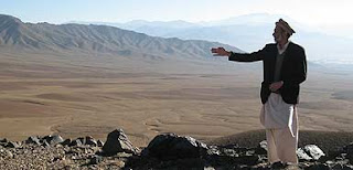

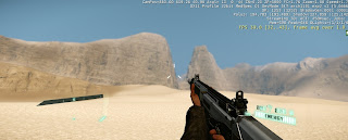
I am happy with my terrain modelling in the CryEngine file in regards to the mountains and the overall appearance, however due to limitations in my knowledge of entities such as rocks, grass, and trees, it was difficult to add such aspects to the design. I feel that most of the entities available in the SDK are intended (or at least work much much better) in a green and lush forest landscape, rather than a pale desert landscape. As such, certain smaller aspects of the landscape detail are not yet fully complete, however due to the middle-eastern terrain being naturally limited in foliage this should not be too much of an issue. Here is a screenshot from the lower and flatter part of the valley, viewing the mountains where the monument will be 'wedged'.
                                      

Following this idea of the flat top of the monument, I decided to use this space as the meeting place, with each monument hanging from below one side of the meeting space. This allowed the meeting place to be the access point to each monument, thus providing the space with more purpose and making it integral as both a structural and functional piece of the monuments. Here is a screenshot of my incomplete S/up model. I still have to add stairs and a few small details such as handrails to allow the space to be more usable, but I am happy with the progress thus far.


Monday, 29 April 2013

EXP 2: COMBINED AXONOMETRICS


EXP 2: CHOSEN AXONOMETRIC AND ELECTROLIQUID AGGREGATION

Here is my chosen axonometric combination with which to develop into my CryEngine landscape. It is a combination of the concepts: 'Raumplan – multi-level articulation of rooms through cubes' and 'spatial fluidity is established through plan and in a vertical hierarchy.'


I feel that these two concepts work well together but are also great descriptions of each architect's work. My electroliquid aggregation is: Rationality and fluidity in architecture is achieved through an articulation of space through multiple levels and a vertical hierarchy - ultimately establishing a layering effect.

Monday, 22 April 2013

EXP 2: INITIAL AXONOMETRICS AND SKETCHUP MODEL IN CRYENGINE


Below is the sketchup model which I based from one of my pairs of axonometric drawings.


I was unable to use Fraps to capture my images from CryEngine due to the requirement of administrator privileges to use the program - which proved an issue as my final work was completed in the Red Centre labs. However, here is three screenshots of my model integrated into a landscape made in the CryEngine editor.


Monday, 25 March 2013

Short film relating to model

I have chosen the following short film, "Three Cubes Colliding" in relation to the design of my below-ground space. The central concept behind my design is the idea of many shapes, particularly cubes, coming together and combining in a way that creates many small open spaces that combine to form a much larger shape and space. I feel that this movie encompasses those concepts.

Applied textures in SketchUp

Below are three images from my SketchUp model. Each exhibit one of the textures made over the last week applied to a surface of my Experiment 1 SketchUp model. The first shows the texture based from the word "framework", and is used as the flooring of my ground floor space. I like this texture choice as it almost depicts a dark stone with lighter cracks running throughout. I feel this texture would work well as the flooring for the exhibition space in the final model, and I would like to develop this further. The second image shows the texture "dense", and is applied to the upper surface of the gigantic curving blocks which make up the ceiling of my first-floor space. I am unsure about the use of this texture in my final piece, and will evaluate this further. The third image shows the texture "classic", and is used as the flooring for the below-ground space. I am also unsure about the inclusion of this texture in my final piece, but like the idea of contrast between concrete walls and a darker floor, particularly within the below-ground space. This exercise proved valuable in both creating/editing my own textures and in applying them and testing different texture configurations and contrasts. 


Projected texture tool models


Here are my models based off the use of the projected texture feature of SketchUp. The first is one of Shinya Kimura's motorcycles and the second is one of Stradivari's violins. The third image shows them included within the ground-floor exhibition space off my Experiment 1 draft model. This image is an example of the intended use of my staircase leading from ground floor to first floor, in which one half of the staircase is used for transportation and the other half is used for displaying the artists' work, allowing the viewer to move around the objects whilst extending the use of a staircase from typically being a medium for transport to becoming a destination.